When personalization starts feeling too familiar
You open an app expecting something new and realize you can predict what will be there: the same creators, the same product categories, the same angles on the same topics. At first, that consistency feels like good personalization. Over time, it can start to feel like repetition dressed up as relevance.
This happens because most personalization systems learn from what’s easiest to measure: clicks, watch time, purchases, and skips. Those signals push the model toward “more of what already worked,” especially when teams are under pressure to hit weekly engagement targets. The feed gets safer, narrower, and less likely to surface the adjacent options that build curiosity and trust over months, not minutes.
How algorithms quietly narrow the menu of options

Picture a recommendation system as two steps: first it builds a shortlist of “likely” items, then it ranks that list. Narrowing often starts in the shortlist. Candidate generators pull from similar creators, adjacent categories, and items that historically converted for people “like you.” If that pool is limited, the ranking model can’t rescue discovery, no matter how sophisticated it is. Over time, your past behavior becomes a gatekeeper: fewer unfamiliar candidates enter the room.
The loop tightens because feedback is selective. Users can only click what they’re shown, so the system gets more confirmation data for familiar options and less signal about everything else. Add business constraints—inventory availability, ad load, partner boosts, safety filters—and the “menu” shrinks further. Exploration mechanisms can counter this, but they carry real costs: short-term engagement dips, higher latency from broader retrieval, and harder-to-explain outcomes when stakeholders ask why a user saw something unexpected.
What users lose: curiosity, context, and surprise
You can see the loss in small behaviors: people stop saving things “for later,” stop following new creators, and spend more time grazing without feeling satisfied. Curiosity needs a little friction—an unfamiliar headline, a product in a neighboring category, a viewpoint that doesn’t perfectly match prior clicks. When the feed is too precise, users learn that wandering won’t pay off. They scroll faster, but explore less.
Context disappears too. A tightly tuned model often strips away the “why this matters” surrounding an item: the range of alternatives, the provenance, the counterexamples, the seasonal or situational reasons something might fit. That makes choices feel arbitrary and interchangeable, even when they’re relevant. Surprise is the final casualty. Not the random kind, but the useful kind that expands a user’s map of what’s possible—and keeps trust intact when interests change or a life moment shifts.
Why platforms keep optimizing for the narrow path
Look at what most teams reward: a lift in click-through, watch time, conversion, or return visits inside a tight window. Narrow personalization is simply easier to justify because it produces clean, attributable gains. Diversity and serendipity show up as slower-burn effects—retention resilience, broader category adoption, fewer “I’m bored” comments—that are harder to tie to a single change and easier to cut when targets are missed.
There’s also operational gravity. Models trained on engagement labels learn the safest route through historical data, and ranking stacks amplify winners because they reduce risk. Exploration raises real costs: more compute and latency to retrieve wider candidates, more moderation exposure, more customer support edge cases, and more stakeholder questions when a user sees something “off.” When budgets and accountability are tight, teams optimize the path they can defend, not the one that keeps the ecosystem healthier over time.
Signs your experience is over-personalized
You can usually tell when personalization has crossed the line because the “new” surface area shrinks. Users keep seeing the same few creators, brands, or formats even after they search, follow someone new, or explicitly skip items. Fresh inventory exists, but it rarely breaks through. In commerce, it shows up as recommendations that mirror the last purchase too literally (same price band, same style, same use case), making the catalog feel smaller than it is.
The warning signs show up in metrics and feedback. Session length may hold while saves, shares, and follows decline, and repeat visits become more habitual than enthusiastic. Category breadth drops, long-tail items stop getting impressions, and exploration features (search, filters, “see more like this”) become less used or less effective. Qualitatively, you hear “stuck,” “same stuff,” “why am I seeing this,” or “I can’t find anything different,” which often arrives before churn does.
Designing for discovery without losing relevance
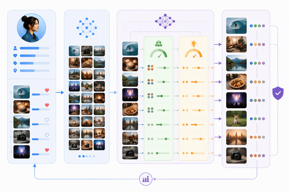
A familiar feed is usually the result of one good idea taken too far: “show the most likely thing.” Designing for discovery means adding deliberate slack back into the system. One practical approach is to reserve a small, consistent portion of impressions for exploration candidates that are meaningfully different, not just lower-scoring versions of the same pattern. That can be enforced with diversity constraints in retrieval and ranking (category caps, creator caps, novelty quotas, or distance-from-history rules), plus session-level pacing so the feed doesn’t clump all the “different” items into one awkward block. The goal isn’t randomness; it’s controlled adjacency—items a user plausibly cares about but hasn’t already over-confirmed.
Users also need tools that actually steer the model. Simple controls like “show me less of this,” “more variety,” topic toggles, and a lightweight “because you watched…” explanation can reduce the sense of being trapped, while generating cleaner signals than rage-scrolling. The discovery work often lowers short-term CTR, so you’ll need guardrail metrics (save/share/follow rate, category breadth, long-tail exposure, downrank/skip fatigue, and medium-horizon retention) and an explicit budget for latency and moderation risk when you widen candidate pools. Relevance stays high when exploration is treated as a product surface with targets, not a side effect of the model.
A healthier default: personalized, not boxed in
Most users don’t want a “neutral” feed; they want a feed that adapts without turning yesterday’s behavior into a permanent identity. A healthier default treats personalization as a flexible hypothesis: it uses recent intent strongly, older intent softly, and always keeps some room for adjacent options that re-test what matters. That means setting explicit variety budgets (not just hoping the model finds them), decaying stale signals, and preventing repeat dominance by any one creator, category, or format.
You’ll often pay with a small CTR dip, higher retrieval cost, and more edge cases to moderate and explain. But the payoff is durability. When interests shift, the experience doesn’t collapse into “same stuff,” because the system has been practicing exploration all along—and users have learned their choices can still reshape what they see.